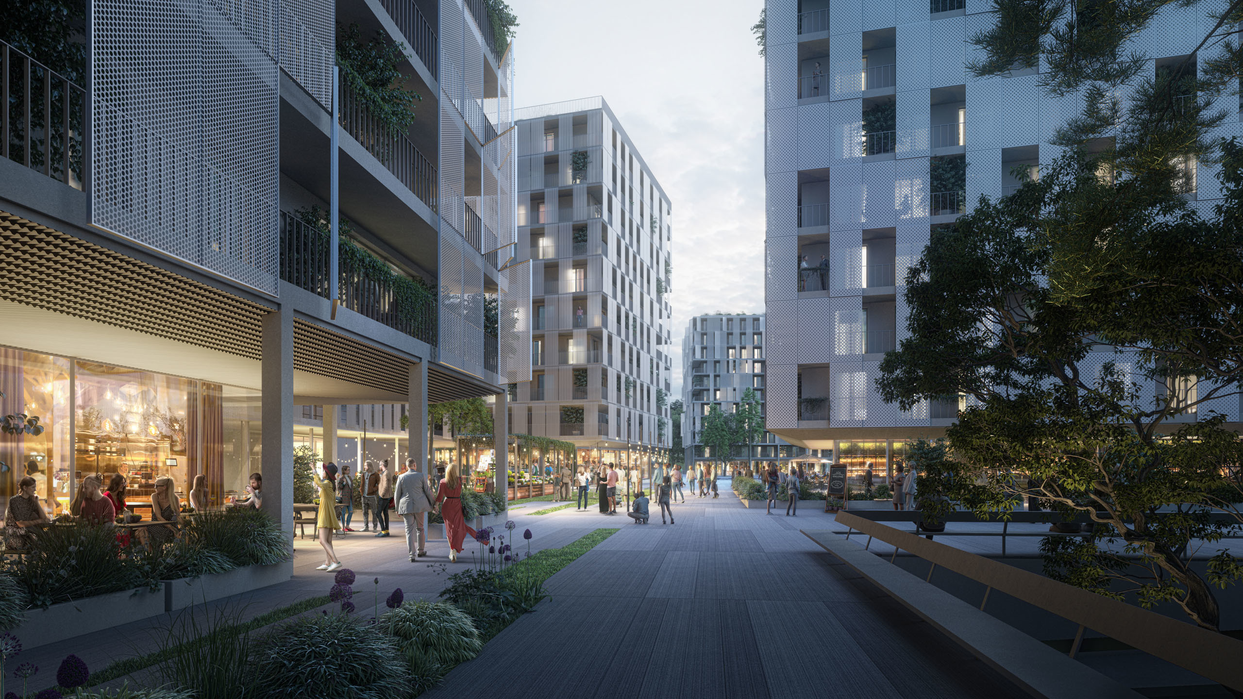
How NOT to make visualizations
What heathens we are! Admit it - we’ve all committed some of these CGI crimes at least once.

On September 18, 2016, I was preparing a presentation for Splash in Prague (an international conference for artists from archviz, CGI, VFX and other industries). At first I was really unsure what to show. I didn't want to make just another presentation showcasing our best projects. Let’s face it, even though it would probably be nice to look at, in the end it would still be the same old boring self-promotion... So, if not our best images, then what to show?
Then it hit me: Do the OPPOSITE: Show them the worst of the worst!
And that’s just what I did. I showed some of our worst images ever. No joke. For the presentation, I grouped the images into 10 different categories, or better said: rules. The feedback from after the presentation was so positive that I decided to make an article out of it, so that even more people can learn from it. So here goes:
10. Ultra-wide camera angle
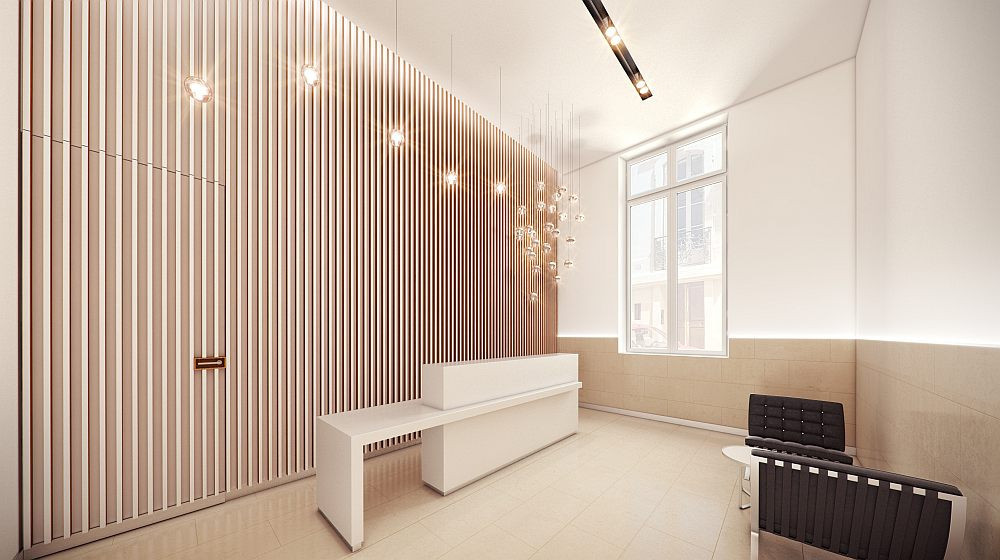
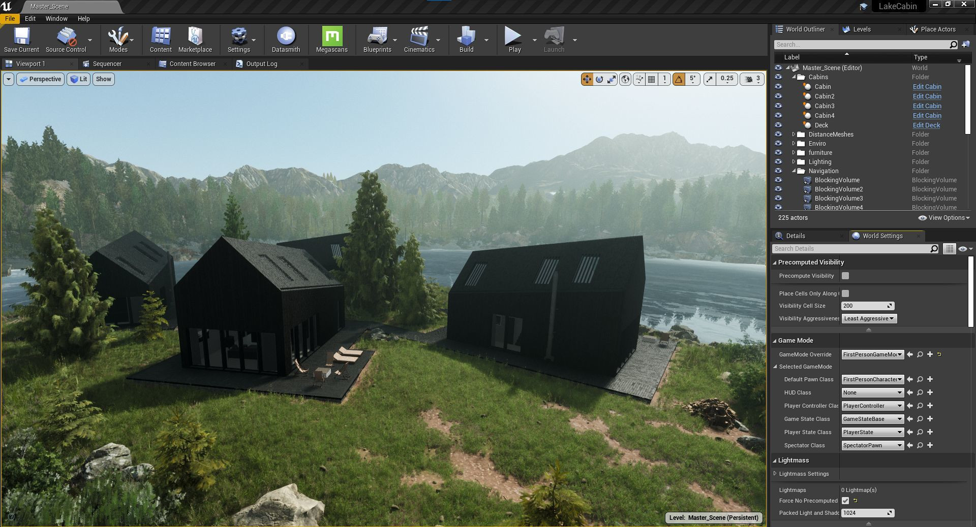
When your client asks you to make the camera angle wider... and wider... and wider... wanting to capture the whole interior and, if possible, even the exterior in a single image, you know something is wrong. They pay you per image, so they want to get the most for their money. Artistic approach, composition, idea behind the image, and storytelling be damned! Just make it wider!
09. Watermark
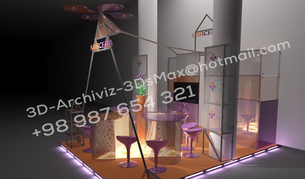
Covering half of the image with your email address and/or telephone number just isn’t an effective way to advertise or protect your artwork... it just doesn’t work. You’ll just end up distracting the viewer away from the artwork.
08. People
There are a couple ways to fail in using people assets:
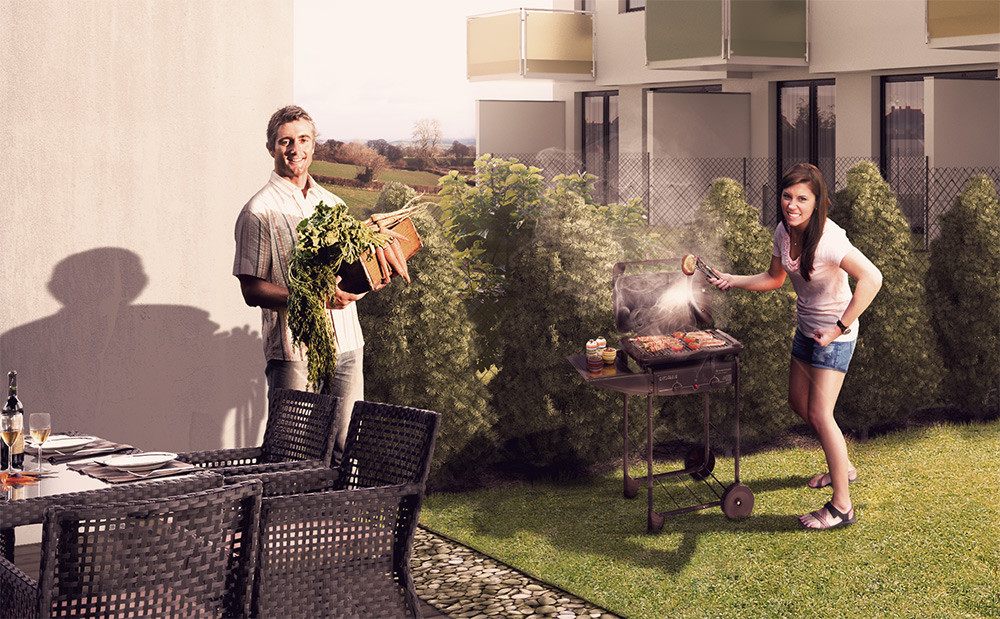
Shiny happy people
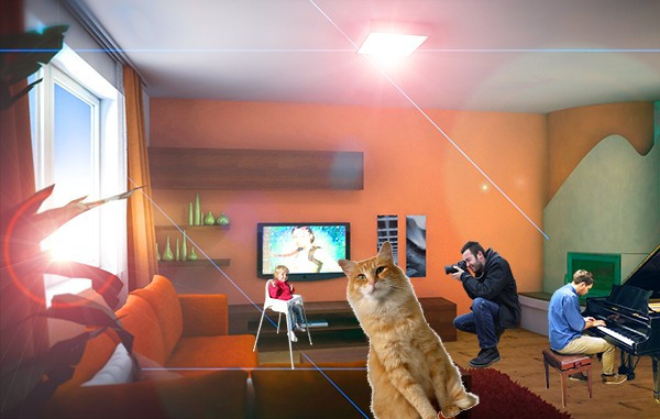
Your images are full of commercial s**t, like a happy cheering crowd on a new, 50x50m concrete platform. What made them happy? Being in the image? The concrete itself? If you are going to use such happy people, give them a reason to smile. Create a story.
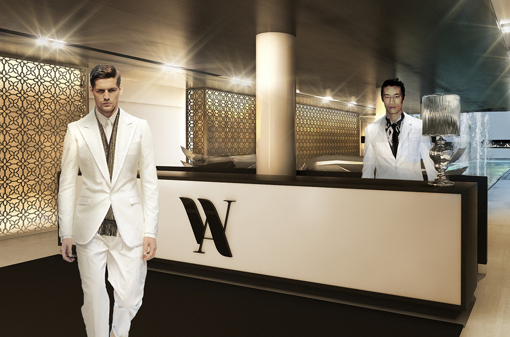
People staring at the photographer
Simple. Don’t show the fronts of their faces, don’t make them look at you. It just leaves the observer feeling embarrassed, stressed, confused, guilty and weird. That’s not a feeling you want your client to have. Become invisible as a photographer, don’t clue anyone into your presence. Be a ghost—an invisible, calm viewer.
07. Odd displacement - fake grass
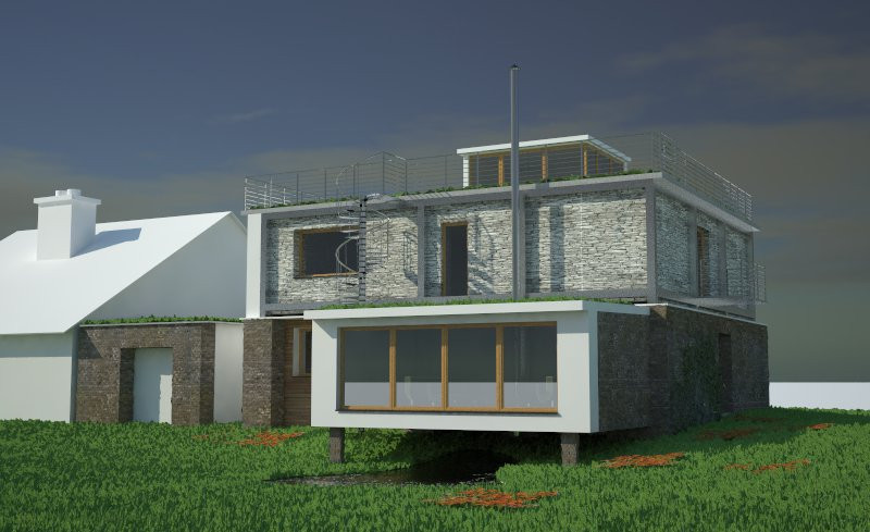
Yeah, some people still use it. Fake grass using displacement, which looks artificial, unrealistic and odd. You have tons of realistic 3D asset resources online—learn how to use them.
06. Transparent assets
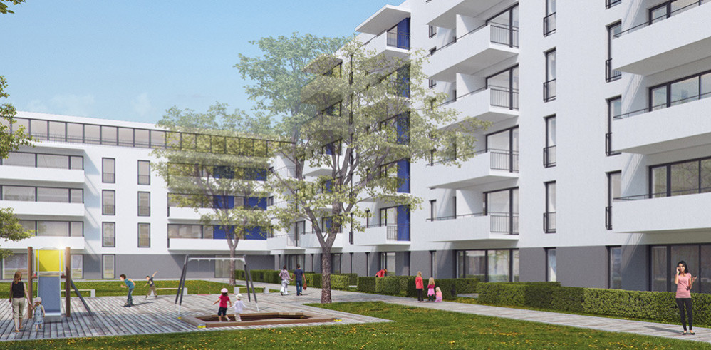
Have you ever seen transparent people, trees or a ghosted neighbouring house? My guess is no. This is a common sin among many architecture studios, using 50% transparency for trees in front of their building, so they don’t conceal their creations. And you, as an artist, are supposed to assist in that. Next time send them an image with the tree and one without it. Let them blend it if they want to.
05. Low quality assets
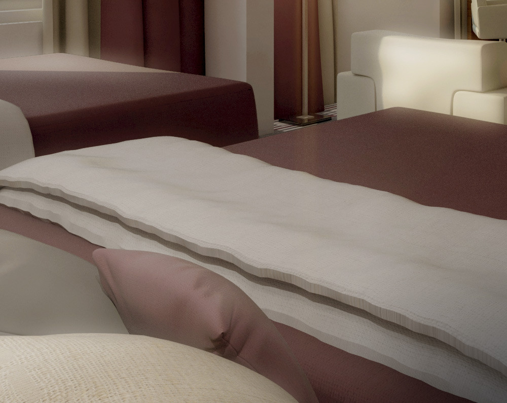
A chain is only as strong as its weakest link. Cliche, but true. Low quality assets lower the quality of the overall image: low-poly people, low-res textures, out-of-place vehicles, trees, or even white blocks for neighbouring buildings. These all detract from the image and leave it uninteresting, forgettable.
04. Odd Cutouts
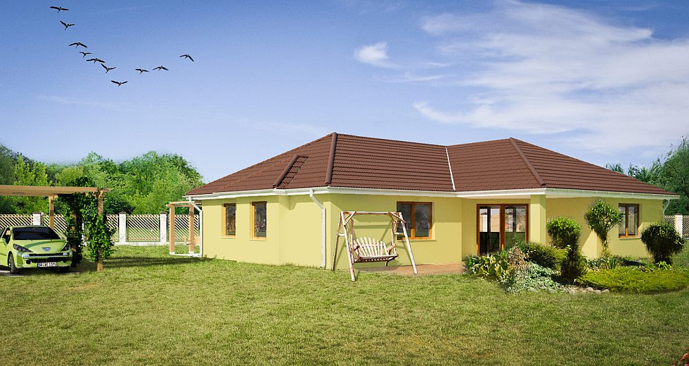
It takes just 5 extra minutes, but it’s worth it. Avoid white halo and ghosting effects. Remove border pixels and blur the edges, so the cutout fits better.
03. Light
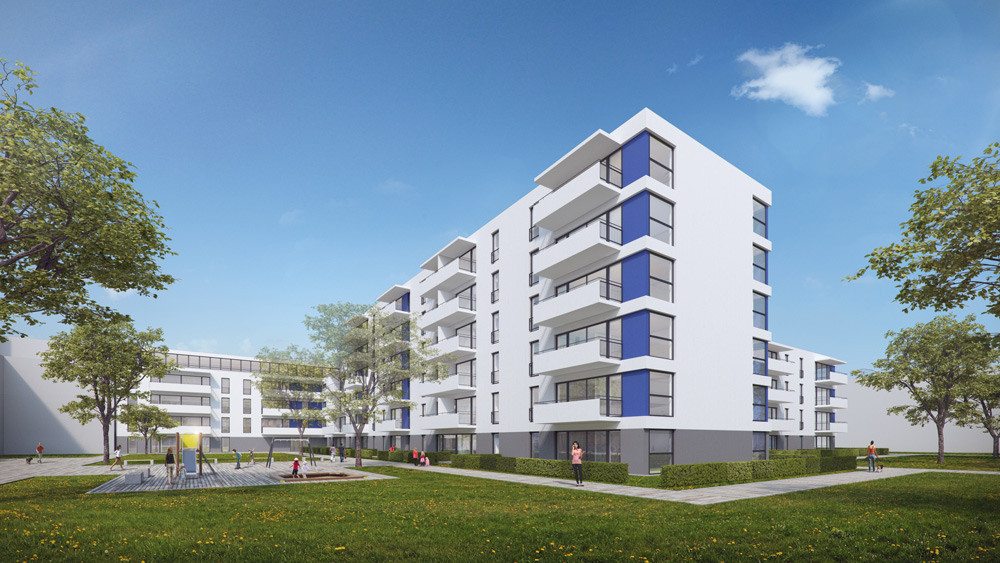
Sun direction from the back
This is a very common request for commercial projects: positioning the sun behind your back, avoiding any shadow.
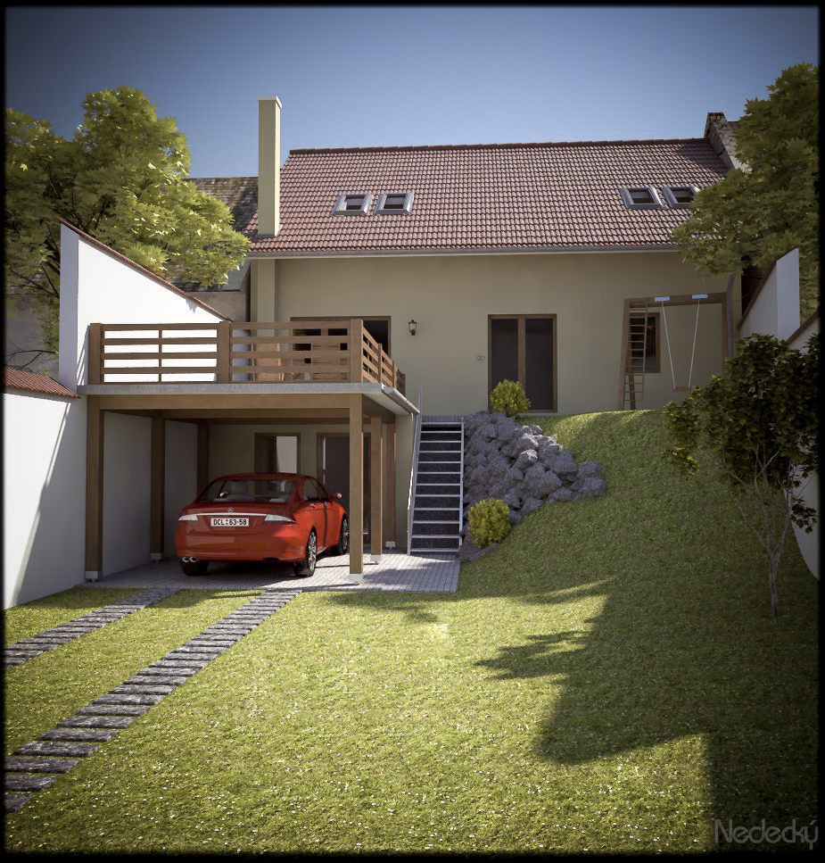
Vignetting / Edge blur
Don’t misuse and go too heavy on the photographic effects. If your image isn’t realistic to begin with, effects won’t save it.
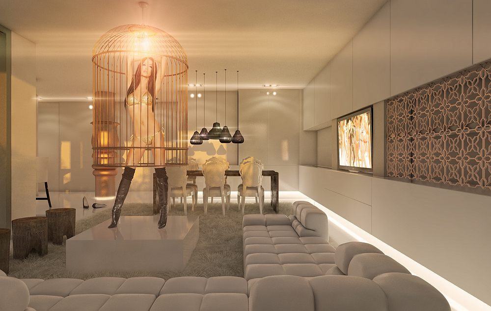
Various light sources
Use natural light, put it in a logical place and at a normal intensity. This is not something that you can compensate for in post-production.
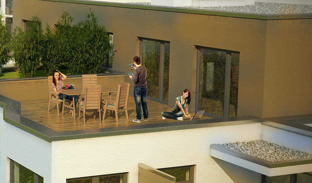
Missing shadows
This is pretty obvious. Assets without proper shadows will just bring the overall quality down.
02. Color palette on LSD
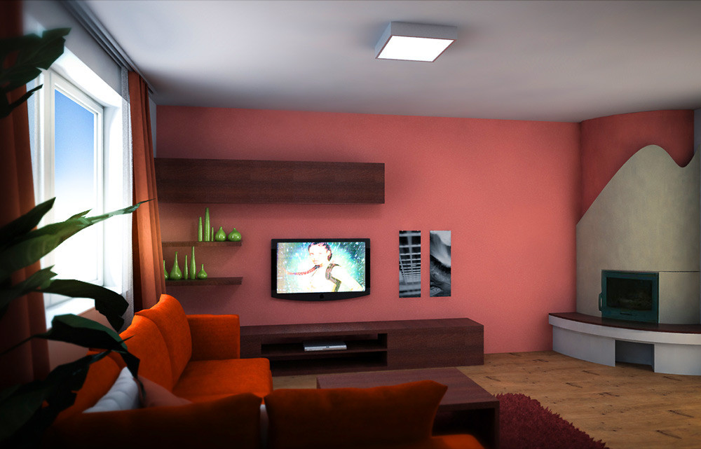
Always think of the color palette in advance. Combine, observe, analyze. Get inspired. Be very careful with your colour palette, as it’s the very first element the naked eye can observe. After that come detail, composition, textures, lights, but colour palette is definitely first.
01. Lens Flare
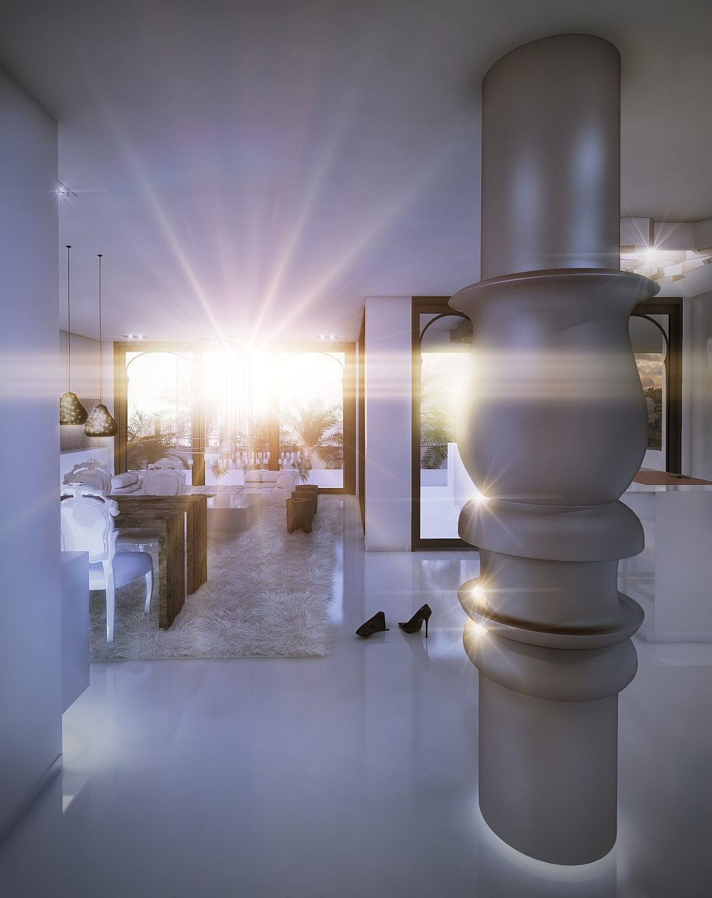
Some people just want to watch the world burn…
***
Want to see our best-of -the-best from recent times? Check out our portfolio HERE.
***
Don't repeat these mistakes and learn from the countless faux pas being repeated in archviz history over and over again. You can thank us later ;)
Have something to add? Join the conversation below!

